New UI and Logo
Hey everyone!
In this post, I am going to talk about our game's new logo and UI. As the logo and UI were the last parts of the art asset production, I am happy to finally introduce them to you guys. Since the main concept of our game is a storybook, most of my inspirations are from the shape of a book.
UI

Firstly, this is a timer UI. This is probably quite an intuitive design and as you can see, I was inspired by an open book. I kept the design simple and used white colour, so players can see it easily.
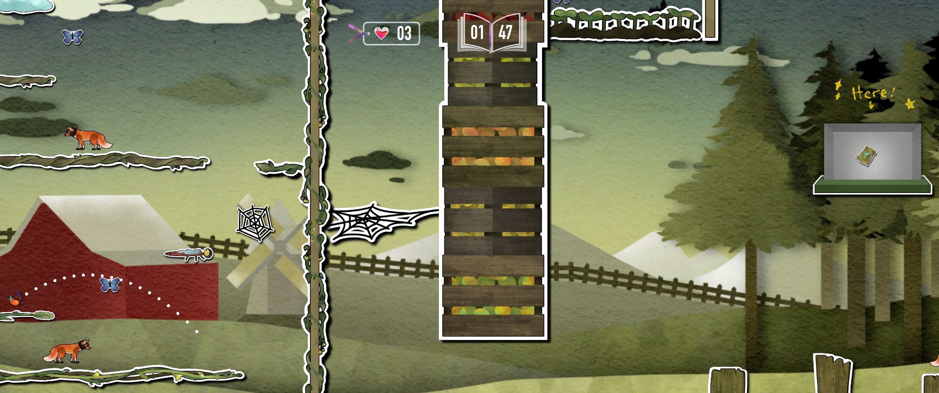
This is a player health UI. I was inspired by a bookmark. As this is placed right next to the timer, I thought it will go well with the timer if it's a bookmark shape.
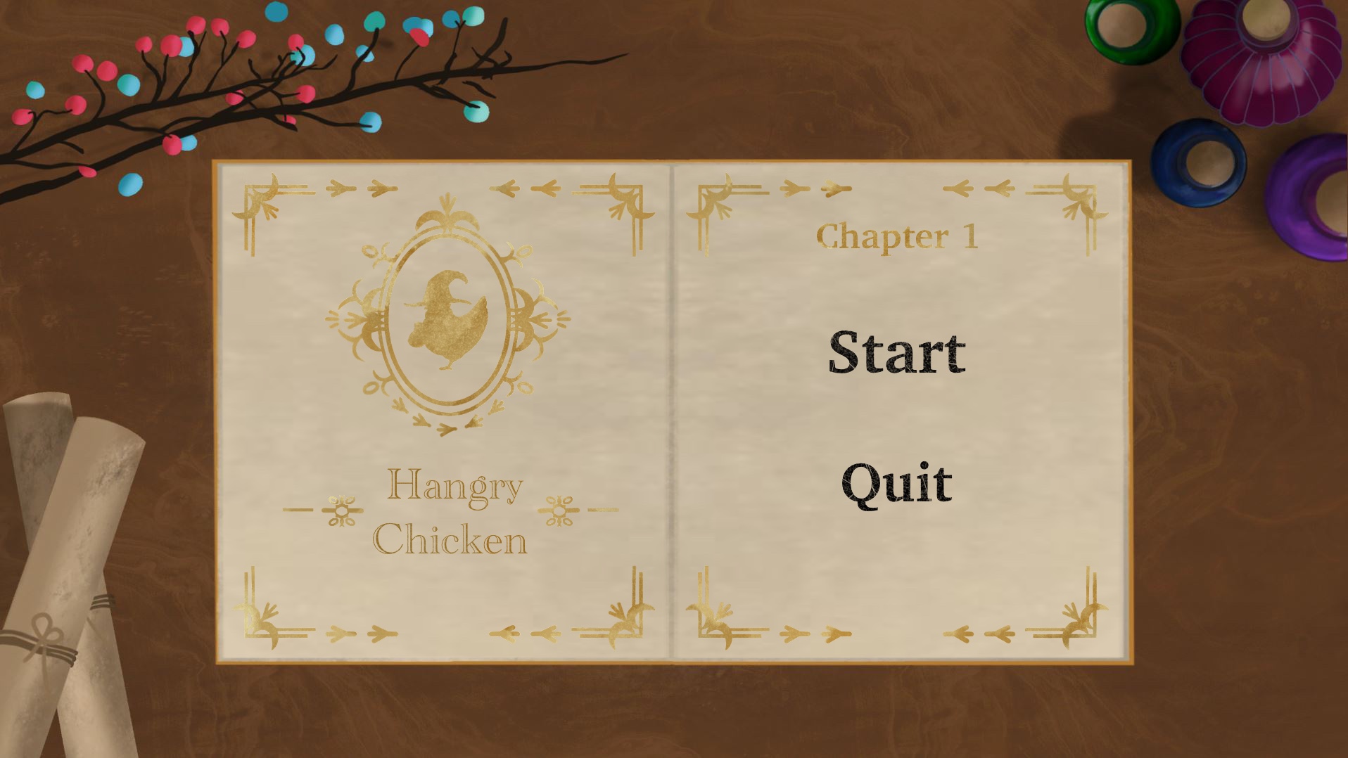
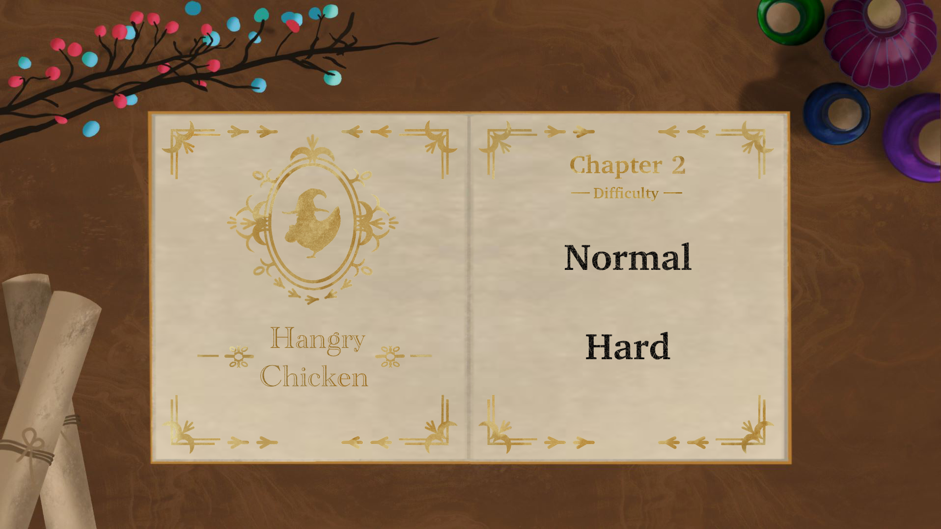
This is the main menu UI that goes into Louise's main menu animation. I made it as a book content page to match the book animation she made. Also, I designed the title of our game to look like a cover page.
Logo
There are two main types of game logos that I designed: one with a cute and colorful fancy feel and the other with a simple and classic feel.
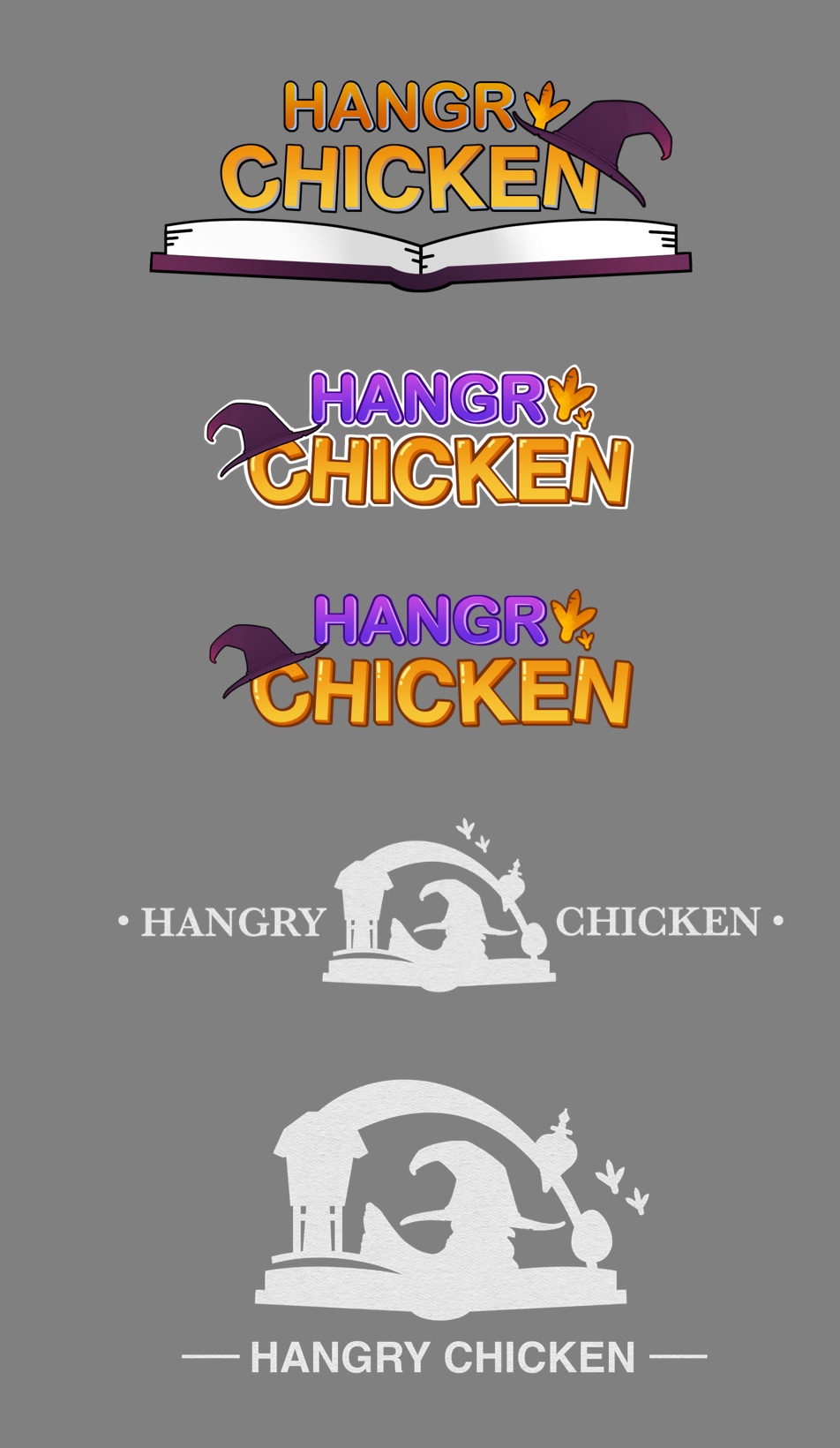
Let us know what you guys think and which logo is your favourite in the comment below! :)
Post by Woolin
Leave a comment
Log in with itch.io to leave a comment.